Proposal Status: Draft for Review
Target: Connectivity Standards Alliance (CSA)
Version: 1.0
Matter successfully standardized how smart home devices communicate—discovery, commissioning, and control protocols are now interoperable across platforms. But Matter is silent on user interfaces.
The result is painfully familiar to every smart home user:
Platform apps (Apple Home, Google Home, Amazon Alexa) provide basic controls—on/off, brightness—but cannot render vendor-specific features, custom clusters, or branded experiences. So vendors continue building proprietary apps, fragmenting the experience Matter was designed to unify.
Matter promised interoperability. Users got app sprawl.
MBX completes Matter's vision by standardizing portable, branded device interfaces that render natively across all platforms.
The concept is simple:
The key insight: Platforms don't need built-in UIs for every device type. They need a runtime that can render any device UI from a simple, sandboxed module. When CSA adds a new device type, platforms support it automatically—no app updates required.
The name reflects the core value proposition for vendors:
Without MBX: Your brand lives in a separate app. Users download it, forget about it, or never install it at all. Your premium features are invisible in the platforms users actually use.
With MBX: Your brand appears directly in Apple Home, Google Home, and Amazon Alexa. Your logo. Your colors. Your special features. The Philips Hue experience inside every platform app—without Philips building or maintaining any of those apps.
One module. Every platform. Full branding.
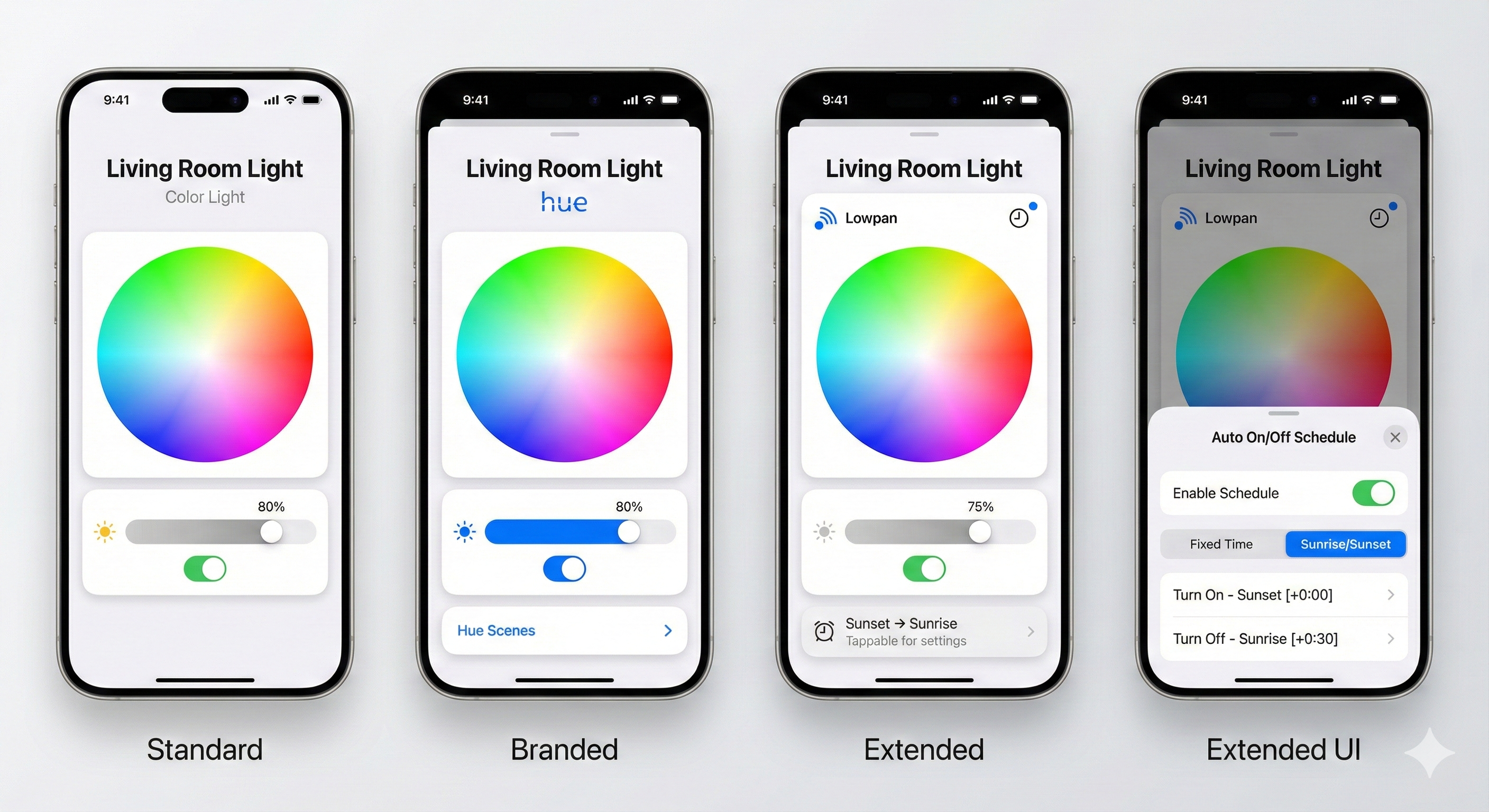
Four levels of MBX rendering for a color light, all using native iOS components:
| Screen | What You See |
|---|---|
| Standard | CSA-provided module. Full functionality, no branding. This is what you get if a vendor does nothing—it's still complete. |
| Branded | Philips adds their Hue logo and a "Hue Scenes" button. Same underlying controls, but now it's THEIR experience in Apple Home. |
| Extended | A different vendor (Lowpan) adds a schedule indicator. Users see "Sunset → Sunrise" right on the main screen. |
| Extended UI | Tapping the schedule opens a native bottom sheet with full scheduling controls. |
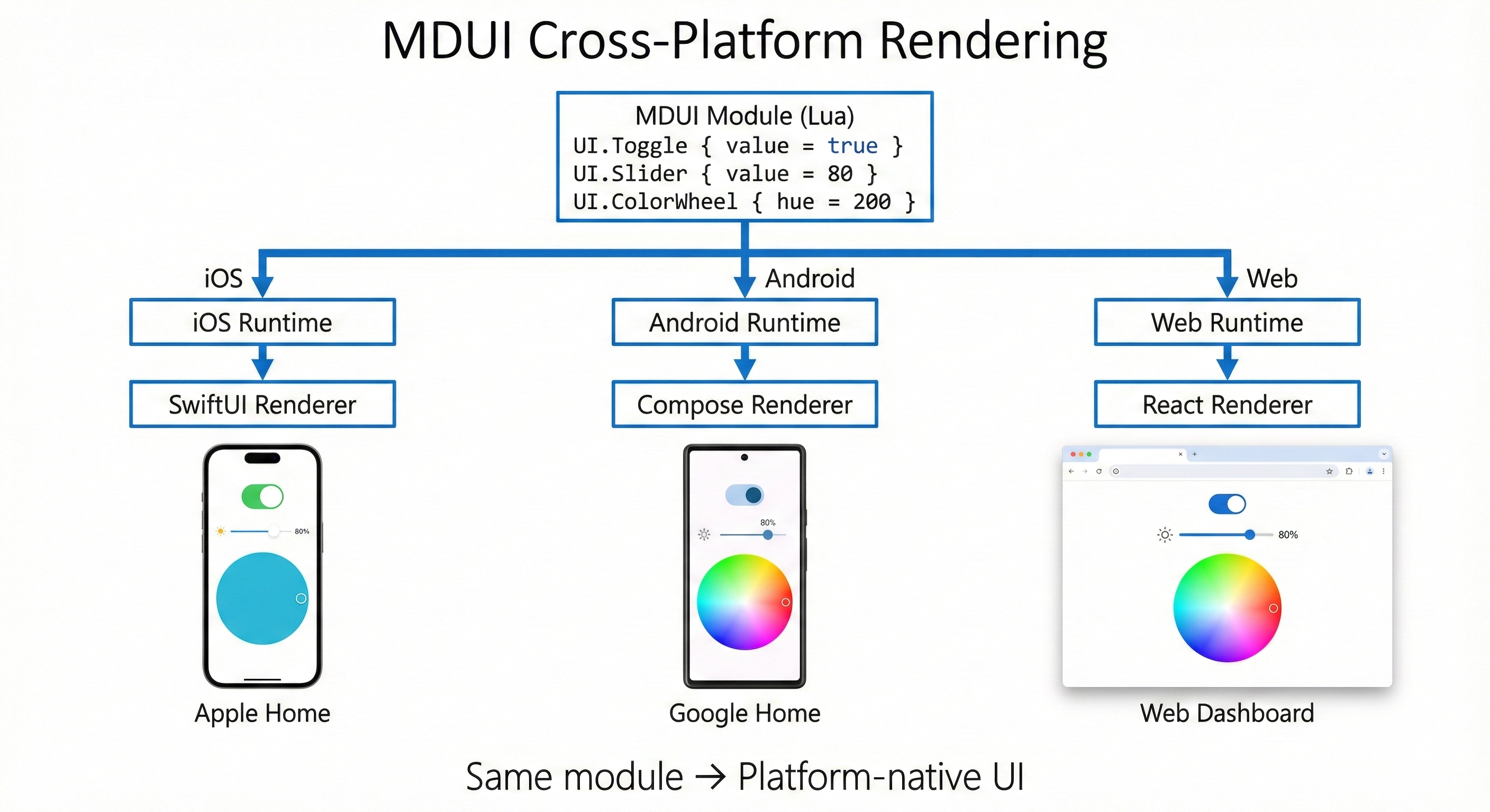
The same module renders with platform-native styling on iOS, Android, and every other platform. Philips doesn't need to maintain iOS and Android apps—they maintain one Lua module.
This is perhaps the most compelling benefit for CSA itself.
Today's Reality:
When CSA ratifies a new device type (Robot Vacuum, Pet Feeder, EV Charger):
With MBX:
CSA controls the pace of innovation. Not platform release cycles.
| Stakeholder | Benefit |
|---|---|
| Users | One app for everything. Full device control. No more "download our app." |
| Device Vendors | Write once, reach all platforms. Brand presence everywhere. No app maintenance. |
| Platform Vendors | Richer ecosystem. Better UX. No more implementing 50+ device type UIs. |
| CSA | Fulfills Matter's promise. Controls new device type rollout. Drives adoption. |
Matter 1.0+ provides excellent interoperability at the protocol level:
What Matter explicitly does NOT address:
A user with a typical smart home (lights, thermostat, locks, sensors) experiences:
| Device | In Apple Home | Full Features |
|---|---|---|
| Philips Hue | On/Off, Brightness, Color | Scenes, Entertainment, Sync → Requires Hue app |
| Ecobee Thermostat | Temperature, Mode | Schedules, Sensors, Reports → Requires Ecobee app |
| Yale Lock | Lock/Unlock | User codes, History, Auto-lock → Requires Yale app |
| Nanoleaf | On/Off, Color | Rhythm, Scenes, Touch actions → Requires Nanoleaf app |
Result: 4 devices = 5 apps (platform + 4 vendor apps)
This directly contradicts Matter's value proposition: "Buy any device, use any app."
Device vendors face an impossible choice:
Option A: Basic Matter Support Only
Option B: Build and Maintain Mobile Apps
Most vendors choose Option B. It's expensive, distracting from their core hardware business, and perpetuates the very fragmentation Matter was supposed to solve.
Platform apps (Apple Home, Google Home) cannot render:
Platforms are limited to generic controls. A $200 Philips Hue bulb looks exactly like a $15 generic bulb in Apple Home. No scenes. No entertainment mode. No Philips experience.
What if vendors could ship a branded UI definition with their device—one that renders natively on every platform?
MBX modules are small programs written in Lua that describe user interfaces. They don't draw pixels—they describe what UI elements should appear (toggles, sliders, buttons) and what happens when users interact with them. Platforms take that description and render it using their native frameworks.
Think of it like HTML for device controls:
Here's what a basic light control module looks like:
local Module = {
    name = "Philips Hue Color Light",
    version = "1.0.0"
}

function Module.render(device, state)
    local onOff = state.OnOff or {}
    local level = state.LevelControl or {}

    return UI.Column {
        children = {
            -- Vendor logo
            UI.Image { src = "https://cdn.philips-hue.com/logo.png", height = 24 },

            -- Power toggle
            UI.Toggle {
                value = onOff.onOff or false,
                label = "Power",
                onChange = function(v) Matter.setOnOff(v) end
            },

            -- Brightness slider
            UI.Slider {
                value = level.currentLevel or 0,
                min = 1, max = 254,
                label = "Brightness",
                onChange = function(v) Matter.setLevel(v) end
            }
        }
    }
end

return Module
That's it. About 25 lines of code. This module:
When this runs on iOS, it becomes native SwiftUI controls. On Android, native Material Design. The module author never thinks about platform differences.
Key components:
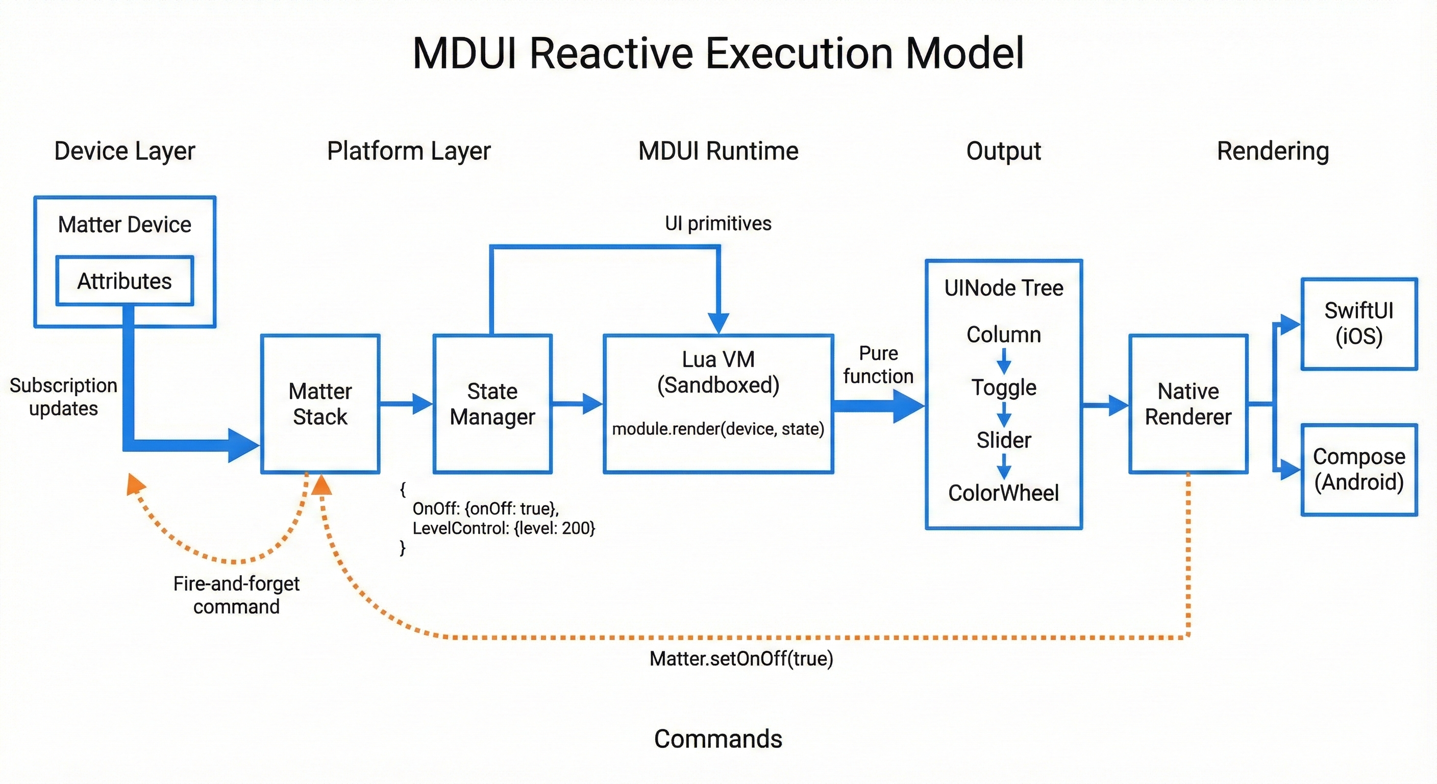
Lua VM (Sandboxed) - Executes the module's render function. Cannot access files, network, or device sensors. Only sees device state and can only output UI descriptions.
Schema Engine - Handles custom cluster encoding. Vendors define their clusters in JSON; the engine handles TLV encoding/decoding automatically.
Native Renderer - Converts the UI description to platform-native controls. The module says "Slider"; iOS renders a SwiftUI Slider; Android renders a Material Slider.
When device state changes, the UI updates automatically:
The module author doesn't manage subscriptions, handle callbacks, or worry about timing. They write a pure function: given this device state, return this UI. The platform handles everything else.
When users interact with controls:
Commands are fire-and-forget. The module says "turn on"; the platform sends the Matter command; the device updates its state; the subscription delivers the update; the UI re-renders. No callbacks, no async handling, no error management in the module code.
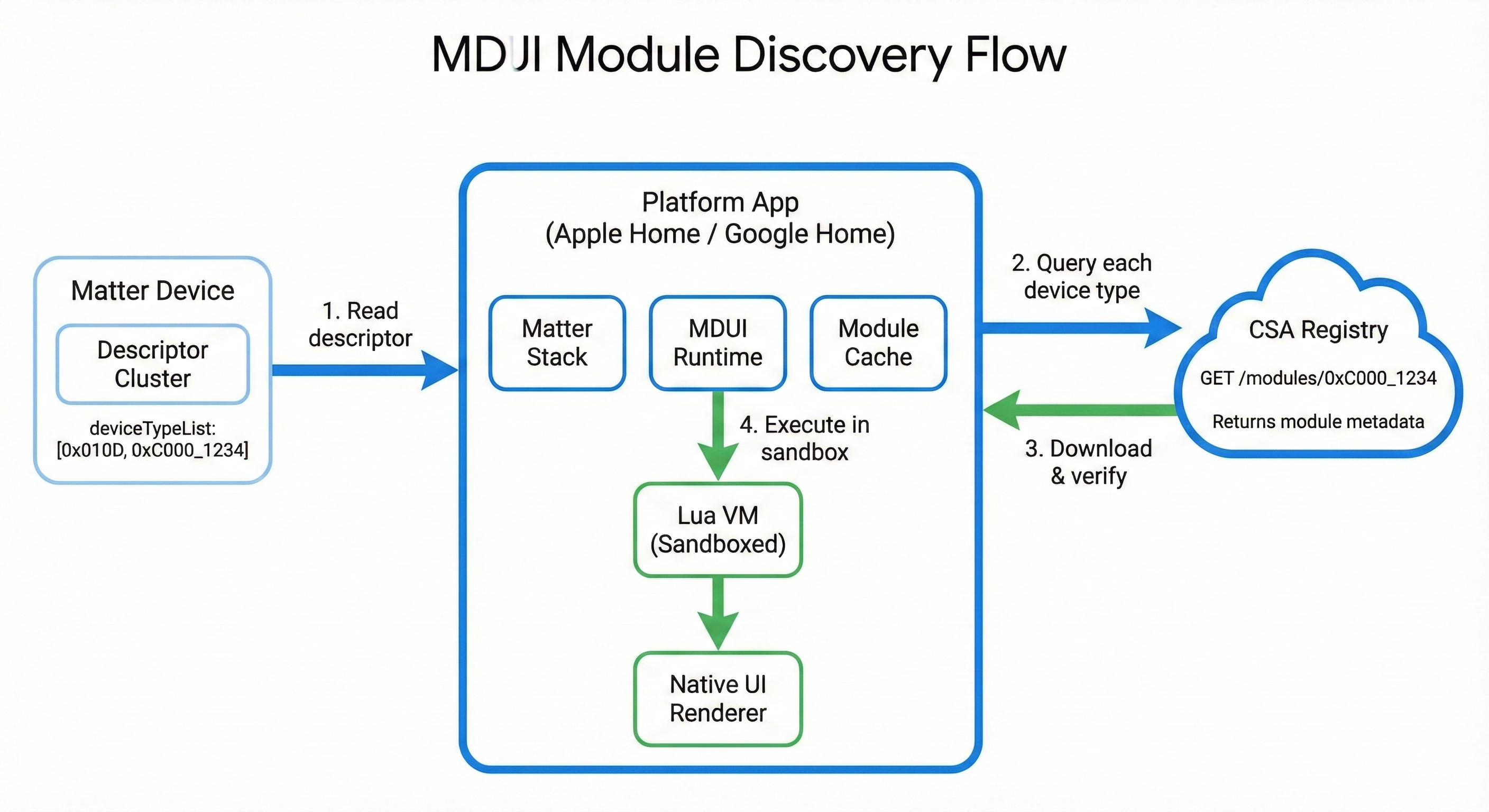
How does a platform know which module to use for a device?
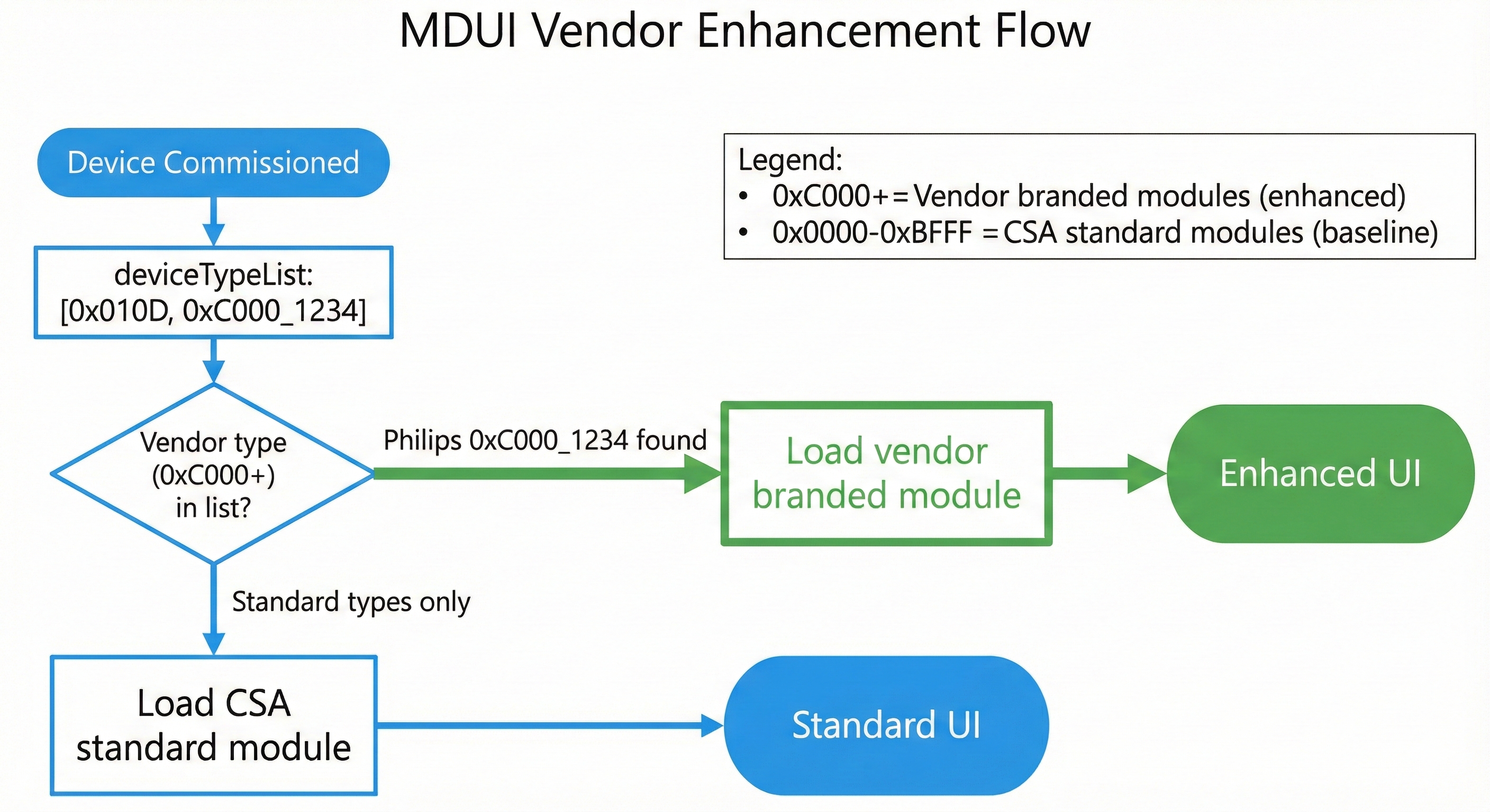
MBX uses vendor-specific device types. Matter already supports endpoints with multiple device types in their deviceTypeList. Vendors add their vendor-specific device type alongside the standard type:
Standard light (no vendor branding):
deviceTypeList: [0x010D]
→ Platform fetches: standard/color_light module
→ Renders full-featured, unbranded UI
Philips Hue light (vendor branding):
deviceTypeList: [0x010D, 0x100B_0001]
                   │         │
                   │         └── Vendor device type (32-bit)
                   │             Upper 16 bits: Vendor ID (0x100B = Philips)
                   │             Lower 16 bits: Device type (0x0001)
                   └── Standard Extended Color Light (baseline capability)

→ Platform sees 0x100B_0001, fetches Philips module
→ Renders branded Philips Hue experience
Device Type ID Format:
0x0000 - 0xFFFE — Defined by CSA0xVVVVDDDD — Upper 16 bits = Vendor ID, Lower 16 bits = Device typeBenefits:
This is a critical architectural advantage that dramatically simplifies platform implementation.
Today's Matter controller apps use ZAP-generated code—device-specific APIs generated from cluster definitions:
Problems with this approach:
| Issue | Impact |
|---|---|
| Code bloat | Thousands of lines of generated Swift/Kotlin per cluster |
| Platform updates required | New clusters require regenerating and shipping new app versions |
| Version coupling | App must match Matter SDK version exactly |
| Custom clusters impossible | Vendor clusters can't be added without platform code changes |
| Maintenance burden | Every cluster change requires regeneration and testing |
MBX controller apps use schema-driven TLV encoding—a single generic engine that reads schemas at runtime:
How it works:
When a Lua module calls:
Matter.command("OnOff", "On", {})
The platform's generic engine:
When the device responds with attribute data:
{ onOff: true }state.OnOff.onOffThe platform never needs cluster-specific code.
| Benefit | Explanation |
|---|---|
| Smaller platform apps | ~500 lines vs thousands of generated lines |
| No platform updates for new clusters | Schema comes with module, not compiled into app |
| Custom clusters work automatically | Vendor schemas handled identically to standard |
| Simpler maintenance | One TLV engine to test, not 50+ cluster implementations |
| Faster development | Platform team writes one engine, done |
| Aspect | Traditional (ZAP) | MBX (Schema-Driven) |
|---|---|---|
| Code size | ~50,000 lines generated | ~500 lines engine |
| New standard cluster | Regenerate, rebuild, ship update | Module update only |
| New vendor cluster | Impossible without platform change | Just works |
| Testing surface | Every generated class | One generic engine |
| Platform coupling | Tight SDK version coupling | Decoupled |
This is one of MBX's most significant technical advantages. Platform vendors implement a single, small TLV engine and never touch cluster-specific code again. All cluster knowledge lives in the schemas bundled with Lua modules.
MBX isn't a novel architecture. It applies patterns already proven at massive scale.
Major companies use server-driven UI to ship UI updates without app releases:
| Company | How It Works | Scale |
|---|---|---|
| Airbnb | Server sends JSON UI descriptions, apps render natively | Millions of users |
| Shopify | Merchant storefronts rendered from server data | Millions of merchants |
| Lyft | Ride experience UI driven by server responses | Millions of rides/day |
| Netflix | Personalized layouts delivered as data | 200M+ subscribers |
The pattern:
MBX applies this exact pattern. Vendor modules send UI descriptions. Platform apps render them natively.
Apple's WidgetKit is architecturally identical to MBX:
| Aspect | WidgetKit | MBX |
|---|---|---|
| UI Model | Declarative SwiftUI | Declarative Lua → UINode |
| Components | Limited SwiftUI views | Limited UI primitives |
| Rendering | iOS renders the widget | Platform renders the module |
| Execution | Sandboxed, limited APIs | Sandboxed, limited APIs |
| Source | App provides widget code | Vendor provides module code |
| Host | iOS Home/Lock Screen | Apple Home / Google Home |
// WidgetKit: App provides declarative UI for iOS to render
struct WeatherWidget: Widget {
    var body: some WidgetConfiguration {
        StaticConfiguration(...) { entry in
            VStack {
                Text(entry.temperature)
                Image(systemName: entry.icon)
            }
        }
    }
}
-- MBX: Vendor provides declarative UI for platform to render
function Module.render(device, state)
    return UI.Column {
        children = {
            UI.Text { text = state.temperature },
            UI.Icon { name = state.icon }
        }
    }
end
WidgetKit is MBX for the home screen. MBX is WidgetKit for smart home devices.
Apple ships WidgetKit to 1+ billion devices. Millions of widgets from thousands of developers run in sandboxed environments. If Apple trusts sandboxed code for the home screen, platforms can trust it for device UI.
Cross-platform frameworks that render native UI from a single codebase:
| Framework | How it works | MBX parallel |
|---|---|---|
| React Native | JavaScript describes UI, native renderers per platform | Lua describes UI, native renderers per platform |
| Flutter | Dart describes UI, consistent rendering engine | Lua describes UI, platform renders natively |
MBX differs in one key way: modules produce declarative output only. The Lua code runs, but it only outputs a UI tree—no direct rendering, no platform API access. This makes it safer (sandboxed) and more consistent (platforms control appearance).
A natural question: "Why not just use JSON for UI descriptions?"
Answer: Device UIs need logic.
Pure data formats (JSON, YAML) can't express this. You need a language.
Why Lua specifically?
| Requirement | Why Lua Fits |
|---|---|
| Easy to sandbox | Lua was designed for embedding; trivial to remove dangerous APIs |
| Small runtime | ~200KB, fits in any mobile app |
| Fast startup | No JIT warmup, instant execution |
| Simple syntax | Vendors learn it in hours, not days |
| Battle-tested | Powers Roblox (70M+ daily users), Redis, Nginx, game engines |
| No dependencies | Single library, no package managers or build tools |
Why not JavaScript?
JavaScript runtimes (V8, JavaScriptCore) are large, have complex sandbox requirements, and bring ecosystem expectations (npm, bundlers) that add friction. Lua is purpose-built for embedding.
Luau (Roblox's typed Lua variant) adds optional type safety and is MIT-licensed. It's the recommended variant for MBX.
This is perhaps the most important architectural decision in MBX:
Platforms do not have built-in native UIs for device types.
Every device—from a basic on/off switch to a complex thermostat—renders through a Lua module downloaded from the registry. CSA provides standard Lua modules for all standard device types.
Consider two alternatives:
Alternative A: Platforms have native UIs (REJECTED)
Alternative B: ALL UI is Lua modules (CHOSEN)
When platforms have native UIs, vendor modules must reimplement everything. The toggle, slider, and color wheel in a vendor module would be different code from the platform's built-in UI—written by different people, with different bugs, potentially different behavior.
With all-Lua, vendors fork the CSA standard module code and add their branding. The vendor module runs standalone—no runtime inheritance, no base class dependencies:
The baseline UI code is literally the same code—copied, not reimplemented. Each module runs independently.

Step 1: CSA provides the standard color light module
-- CSA Standard Extended Color Light Module
-- Device type: 0x010D
local Module = {
    name = "Color Light",
    deviceType = 0x010D,
    version = "1.0.0"
}

function Module.render(device, state)
    local onOff = state.OnOff or {}
    local level = state.LevelControl or {}
    local color = state.ColorControl or {}

    return UI.Column {
        spacing = 16,
        children = {
            -- Power toggle
            UI.Toggle {
                value = onOff.onOff or false,
                label = "Power",
                onChange = function(v) Matter.setOnOff(v) end
            },

            -- Brightness slider
            UI.Slider {
                value = level.currentLevel or 0,
                min = 1, max = 254,
                label = "Brightness",
                onChange = function(v) Matter.setLevel(v) end
            },

            -- Color wheel
            UI.ColorWheel {
                hue = color.currentHue or 0,
                saturation = color.currentSaturation or 0,
                onChange = function(h, s) Matter.setColor({hue=h, saturation=s}) end
            }
        }
    }
end

return Module
Step 2: Philips copies this code, adds their branding
-- Philips Hue Color Light Module
-- FORKED FROM: standard/color_light v1.0.0
local Module = {
    name = "Philips Hue Color Light",
    deviceType = 0x100B_0001,      -- ← Changed: vendor device type (Philips 0x100B)
    baseDeviceType = 0x010D,       -- ← Added: documents what this extends
    version = "1.0.0",

    branding = {                   -- ← Added: vendor branding
        logo = "https://cdn.philips-hue.com/logo.png",
        accentColor = "#0066FF"
    }
}

function Module.render(device, state)
    local onOff = state.OnOff or {}
    local level = state.LevelControl or {}
    local color = state.ColorControl or {}

    return UI.Column {
        spacing = 16,
        children = {
            -- ↓↓↓ ADDED: Vendor logo ↓↓↓
            UI.Image { src = Module.branding.logo, height = 24 },

            -- Power toggle (UNCHANGED from standard)
            UI.Toggle {
                value = onOff.onOff or false,
                label = "Power",
                onChange = function(v) Matter.setOnOff(v) end
            },

            -- Brightness slider (UNCHANGED from standard)
            UI.Slider {
                value = level.currentLevel or 0,
                min = 1, max = 254,
                label = "Brightness",
                onChange = function(v) Matter.setLevel(v) end
            },

            -- Color wheel (UNCHANGED from standard)
            UI.ColorWheel {
                hue = color.currentHue or 0,
                saturation = color.currentSaturation or 0,
                onChange = function(h, s) Matter.setColor({hue=h, saturation=s}) end
            },

            -- ↓↓↓ ADDED: Vendor-specific feature ↓↓↓
            UI.Button {
                label = "Hue Scenes",
                onClick = function()
                    Navigation.openSheet("hue_scenes")
                end
            }
        }
    }
end

return Module
What Philips actually changed:
| Benefit | Explanation |
|---|---|
| Vendors get 90% of code for free | Literally copy-paste the standard module |
| Guaranteed consistent baseline | Same toggle, slider, color wheel code = same behavior |
| Updates flow downstream | When CSA improves standard module, vendors can merge changes |
| Lower barrier to entry | Small vendors ship branded UI in hours, not months |
| Platform simplicity | Platforms only implement Lua runtime + UINode renderer |
| No special cases | Standard and vendor modules use identical code path |
All conforming platforms MUST implement these primitives:
| Primitive | Purpose | Key Properties |
|---|---|---|
Column |
Vertical layout | children, spacing, padding, alignment |
Row |
Horizontal layout | children, spacing, alignment |
Text |
Labels, values | text, size, weight, color |
Toggle |
On/Off switch | value, label, onChange |
Slider |
Range input | value, min, max, step, label, onChange |
Button |
Actions | label, onClick, variant, icon |
Card |
Grouped content | children, title |
Icon |
Semantic icons | name, size, color |
Spacer |
Flexible space | - |
Divider |
Visual separator | - |
Platforms SHOULD implement these for richer device experiences:
| Primitive | Purpose | Key Properties |
|---|---|---|
ColorWheel |
Hue/Saturation picker | hue, saturation, onChange |
ColorTemperature |
Warm/Cool slider | mireds, min, max, onChange |
SegmentedControl |
Mode selection | value, options, onChange |
Tabs |
Tabbed content | tabs, selected |
Image |
Logos, icons | src, width, height |
ProgressBar |
Loading, levels | value, max |
Many devices have features that don't fit on the main control screen—schedules, automation rules, advanced settings. MBX supports secondary screens:
| Primitive | Purpose | Key Properties |
|---|---|---|
Sheet |
Modal bottom sheet | content, title, icon, onClose |
IconButton |
Compact navigation trigger | icon, label, onPress |
TimePicker |
Time selection | value, onChange, mode |
DatePicker |
Date selection | value, onChange |
ListItem |
Settings row | title, subtitle, trailing, onPress |
Switch |
Inline toggle | value, onChange |

Platforms render each primitive using their native UI framework:
| Primitive | SwiftUI (iOS) | Compose (Android) |
|---|---|---|
Column |
VStack |
Column |
Row |
HStack |
Row |
Text |
Text |
Text |
Toggle |
Toggle |
Switch |
Slider |
Slider |
Slider |
Button |
Button |
Button / FilledTonalButton |
Card |
GroupBox |
Card |
Icon |
Image(systemName:) |
Icon (Material) |
ColorWheel |
Custom View | Custom Composable |
Tabs |
TabView |
TabRow + Pager |
Sheet |
UISheetPresentationController |
ModalBottomSheet |
Important: Platforms control visual styling. A Toggle looks like an iOS toggle on Apple Home, a Material switch on Google Home. Modules define structure and behavior; platforms define appearance. This ensures device UIs feel native on each platform.
Many vendors differentiate through features not covered by standard Matter clusters:
These features require custom clusters—vendor-specific data and commands.
Vendors provide two things:
1. Schema (JSON) - Defines how to encode/decode custom cluster data:
{
  "clusters": {
    "PhilipsHueEntertainment": {
      "id": 4294115000,
      "attributes": {
        "entertainmentMode": { "id": 0, "type": "enum8" },
        "syncActive": { "id": 1, "type": "boolean" }
      },
      "commands": {
        "StartSync": {
          "id": 0,
          "request": {
            "groupId": { "id": 0, "type": "uint16" },
            "mode": { "id": 1, "type": "enum8" }
          }
        },
        "StopSync": {
          "id": 1,
          "request": {}
        }
      },
      "enums": {
        "EntertainmentModeEnum": {
          "Off": 0,
          "Music": 1,
          "Video": 2,
          "Game": 3
        }
      }
    }
  }
}
2. Lua Module - Uses custom cluster by name:
function Module.render(device, state)
    local entertainment = state.PhilipsHueEntertainment or {}
    local mode = entertainment.entertainmentMode or 0

    return UI.SegmentedControl {
        value = mode,
        options = {
            { label = "Off", value = 0 },
            { label = "Music", value = 1 },
            { label = "Video", value = 2 }
        },
        onChange = function(m)
            Matter.command("PhilipsHueEntertainment", "StartSync", {
                groupId = 1, mode = m
            })
        end
    }
end
The Lua module uses human-readable names. The platform's schema engine handles the mapping:
Every interaction with the outside world goes through platform-controlled APIs. The vendor can implement arbitrary UI logic but cannot escape the sandbox.
The Lua sandbox allows:
| Allowed | Blocked |
|---|---|
| Return UI node tree | Access file system |
Call Matter.command() |
Make network requests |
Read state (device attributes) |
Access device sensors |
| Basic Lua logic (if/for/functions) | Import external libraries |
Call L() for localization |
Access other apps/processes |
This is exactly how WidgetKit works: widget code runs but can only return views and request timeline updates—no arbitrary network or file access.
MBX modules are code that executes on user devices within platform apps. The security model addresses:
Modules execute in a restricted Lua VM:
No access to:
Access only to:
-- These are the ONLY globals available to modules:
UI = { Column, Row, Text, Toggle, Slider, ... }  -- UI primitives
Matter = { setOnOff, setLevel, command, ... }    -- Matter commands
L = function(key) ... end                         -- Localization
device = { id, name, deviceTypes, ... }          -- Device metadata
state = { OnOff = {...}, ... }                    -- Current state
Vendors already have signing key pairs at CSA for Matter device certification. MBX reuses this infrastructure—no new PKI required.
Module Package:
├── module.lua          (the code)
├── schema.json         (cluster definitions)
├── strings/            (localization)
├── manifest.json       (metadata: deviceType, version)
└── signature.sig       (signed with existing CSA vendor key)
Benefits:
Central registry for certified modules, indexed by device type:
GET /modules/0x100B_0001

Returns:
{
  "deviceType": "0x100B_0001",
  "moduleUrl": "https://registry.csa.io/modules/...",
  "version": "1.2.0",
  "signature": "...",
  "vendorCert": "...",
  "certifiedAt": "2025-01-15T...",
  "expiresAt": "2026-01-15T..."
}
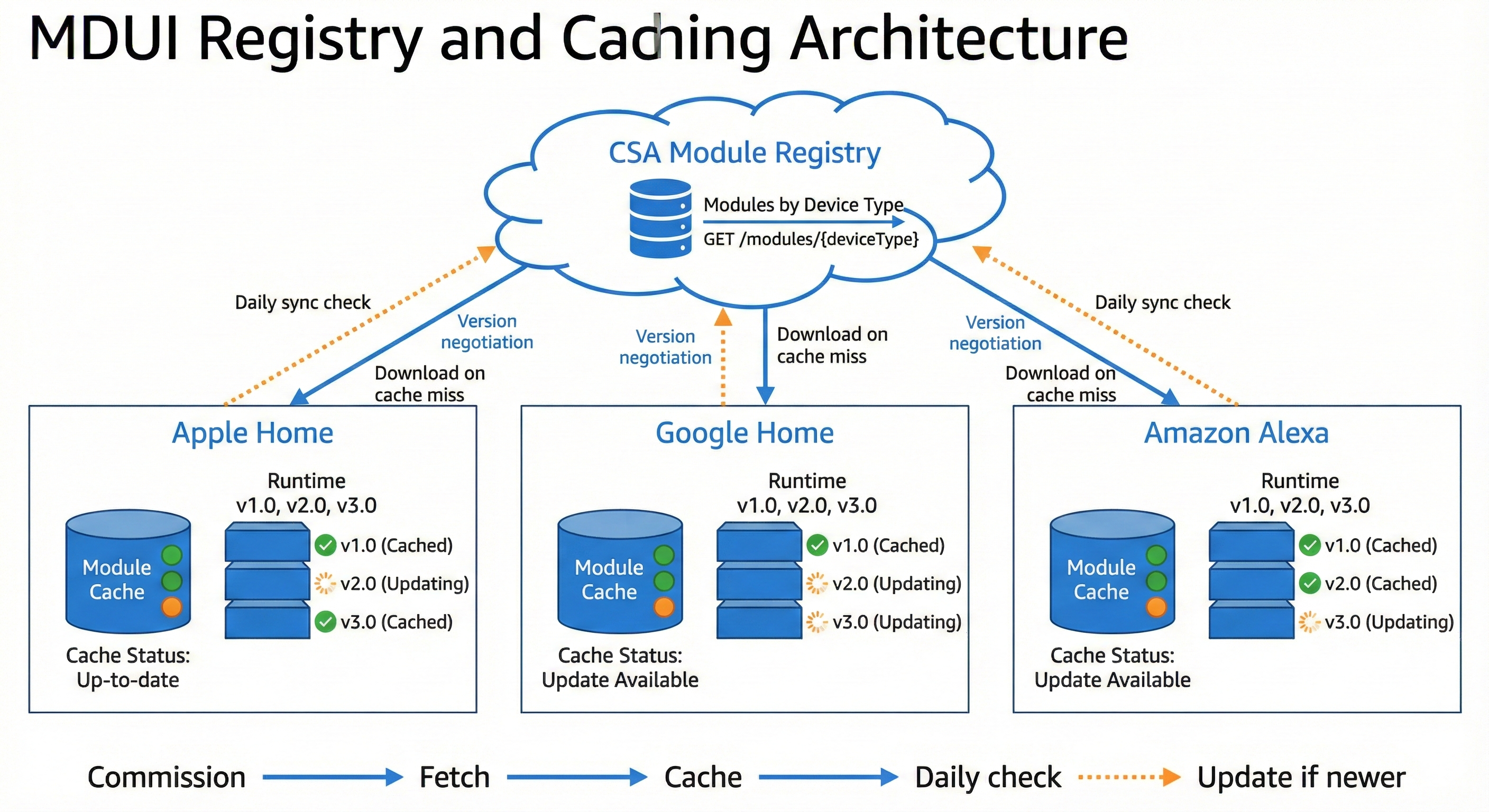
Caching Strategy:
| Event | Action |
|---|---|
| First device commission | Fetch module, cache locally |
| App launch | Use cached module immediately |
| Background (daily) | Check for updates |
| Device offline | Cached module still works |
Modules are small (typically <50KB), so caching is cheap.
Before a module is listed:
Platforms enforce limits per module:
| Resource | Limit | Action on Exceed |
|---|---|---|
| CPU time per render | 50ms | Terminate, show error |
| Memory | 10MB | Terminate, show error |
| Render frequency | 60/sec | Throttle |
| UI node count | 500 | Truncate |
| Network calls | 0 | Block |
| File access | 0 | Block |
If a module is malicious:
MBX will evolve. New primitives will be added. APIs will expand. How do we ensure:
MBX uses a runtime version system:
local Module = {
    name = "Philips Hue Color Light",
    version = "2.1.0",              -- Module's own version
    deviceType = 0x100B_0001,       -- Vendor device type (Philips 0x100B)
    minRuntimeVersion = "2.0",      -- Minimum MBX runtime required

    requiredPrimitives = { "Toggle", "Slider", "ColorWheel" },
    optionalPrimitives = { "ColorTemperatureArc" }  -- Falls back if missing
}
Each runtime version defines:
| Runtime | Key Additions |
|---|---|
| 1.0 | Core primitives (Toggle, Slider, Button, etc.), basic Matter API |
| 2.0 | ColorWheel, ColorTemperature, Tabs, enhanced Matter API |
| 3.0 | Animation support, conditional visibility, nested navigation |
For Platforms:
For Modules:
minRuntimeVersion to require newer featuresIf a module uses a primitive the platform doesn't support:
optionalPrimitives - skip if optionalColorWheel → two Sliders for hue/saturation)CSA provides Lua modules for ALL standard Matter device types. These serve two purposes:
| Device Type | ID | Clusters | Module |
|---|---|---|---|
| On/Off Light | 0x0100 | OnOff | standard/onoff_light |
| Dimmable Light | 0x0101 | OnOff, LevelControl | standard/dimmable_light |
| Color Temperature Light | 0x010C | OnOff, LevelControl, ColorControl | standard/color_temp_light |
| Extended Color Light | 0x010D | OnOff, LevelControl, ColorControl | standard/color_light |
| On/Off Plug-in Unit | 0x010A | OnOff | standard/onoff_plug |
| Dimmable Plug-in Unit | 0x010B | OnOff, LevelControl | standard/dimmable_plug |
| Device Type | ID | Clusters | Module |
|---|---|---|---|
| Temperature Sensor | 0x0302 | TemperatureMeasurement | standard/temperature_sensor |
| Humidity Sensor | 0x0307 | RelativeHumidityMeasurement | standard/humidity_sensor |
| Occupancy Sensor | 0x0107 | OccupancySensing | standard/occupancy_sensor |
| Contact Sensor | 0x0015 | BooleanState | standard/contact_sensor |
| Light Sensor | 0x0106 | IlluminanceMeasurement | standard/light_sensor |
| Pressure Sensor | 0x0305 | PressureMeasurement | standard/pressure_sensor |
| Flow Sensor | 0x0306 | FlowMeasurement | standard/flow_sensor |
| Water Leak Detector | 0x0043 | BooleanState | standard/water_leak |
| Smoke CO Alarm | 0x0076 | SmokeCoAlarm | standard/smoke_alarm |
| Device Type | ID | Clusters | Module |
|---|---|---|---|
| Thermostat | 0x0301 | Thermostat | standard/thermostat |
| Fan | 0x002B | FanControl | standard/fan |
| Device Type | ID | Clusters | Module |
|---|---|---|---|
| Door Lock | 0x000A | DoorLock | standard/door_lock |
| Window Covering | 0x0202 | WindowCovering | standard/window_covering |
Since vendors already have CSA credentials for Matter certification, MBX participation is simple:
No new keys, no new verification, no new fees—just an opt-in.
Platforms implement MBX runtime to support devices with vendor-specific clusters.
Trigger: Device has clusters not in platform's UI library Benefit: Immediate support for devices that currently require vendor apps
Platforms load MBX modules for devices with vendor-specific device types.
Trigger: Vendor provides branded module Benefit: Vendors differentiate within platform apps
Platforms transition all device UIs to MBX rendering.
Trigger: Platform strategic decision Benefit: Consistent architecture, automatic new device type support
CSA will provide:
iOS (Swift)
Android (Kotlin)
| Phase | Deliverable |
|---|---|
| Specification Draft | Complete MBX spec |
| Reference Implementation | iOS + Android runtimes |
| Pilot Program | 10 vendors, 2 platforms |
| Public Launch | Registry opens, spec finalized |
The following topics require detailed specification work but are intentionally deferred. They do not block the core architecture.
| Topic | Notes |
|---|---|
| Groups | How does a module render UI for a group of devices? May require group-aware render function. |
| Scenes | Scene creation/editing. Platform may handle; modules render individual devices. |
| Multi-endpoint devices | Power strip with 4 outlets. Module receives endpoint list, renders sub-UIs. |
| Bridged devices | Transparent to modules—bridge exposes standard endpoints. |
| Offline behavior | Module receives device.online flag; platform handles offline states. |
| Commissioning UI | Device-specific setup flows. Separate module type or platform handles generically. |
| Firmware update UI | Platform responsibility; standard OTA cluster. |
| Accessibility | Platform applies accessibility to rendered primitives. |
These will be addressed in subsequent specification drafts.
We propose the CSA establish a working group to develop the Matter Brand Experience specification, with:
One module. Every platform. Full branding.
Matter promised interoperability. MBX delivers it.
local Module = {
    name = "Thermostat",
    deviceType = 0x0301
}

function Module.render(device, state)
    local thermo = state.Thermostat or {}

    local currentTemp = thermo.localTemperature
    local displayTemp = currentTemp and string.format("%.1f°", currentTemp / 100) or "--"

    local mode = thermo.systemMode or 0
    local heatSetpoint = (thermo.occupiedHeatingSetpoint or 2000) / 100
    local coolSetpoint = (thermo.occupiedCoolingSetpoint or 2600) / 100

    local isHeating = (thermo.thermostatRunningState or 0) & 0x01 ~= 0
    local isCooling = (thermo.thermostatRunningState or 0) & 0x02 ~= 0

    return UI.Column {
        spacing = 16,
        children = {
            -- Current temperature
            UI.Card {
                children = {
                    UI.Column {
                        alignment = "center",
                        children = {
                            UI.Text { text = displayTemp, size = 64, weight = "bold" },
                            UI.Text {
                                text = isHeating and "Heating" or (isCooling and "Cooling" or "Idle"),
                                color = "secondary"
                            }
                        }
                    }
                }
            },

            -- Mode selector
            UI.SegmentedControl {
                value = mode,
                options = {
                    { label = "Off", value = 0 },
                    { label = "Heat", value = 4 },
                    { label = "Cool", value = 3 },
                    { label = "Auto", value = 1 }
                },
                onChange = function(m)
                    Matter.writeAttribute("Thermostat", "systemMode", m)
                end
            },

            -- Heat setpoint (shown in Heat or Auto mode)
            (mode == 4 or mode == 1) and UI.Slider {
                value = heatSetpoint,
                min = 7, max = 30,
                step = 0.5,
                label = "Heat to",
                onChange = function(v)
                    Matter.writeAttribute("Thermostat", "occupiedHeatingSetpoint", v * 100)
                end
            },

            -- Cool setpoint (shown in Cool or Auto mode)
            (mode == 3 or mode == 1) and UI.Slider {
                value = coolSetpoint,
                min = 16, max = 32,
                step = 0.5,
                label = "Cool to",
                onChange = function(v)
                    Matter.writeAttribute("Thermostat", "occupiedCoolingSetpoint", v * 100)
                end
            }
        }
    }
end

return Module
local Module = {
    name = "Door Lock",
    deviceType = 0x000A
}

function Module.render(device, state)
    local lock = state.DoorLock or {}

    local lockState = lock.lockState
    local isLocked = lockState == 1
    local isUnlocked = lockState == 2

    return UI.Column {
        spacing = 16,
        children = {
            -- Lock state indicator
            UI.Card {
                children = {
                    UI.Column {
                        alignment = "center",
                        children = {
                            UI.Icon {
                                name = isLocked and "lock" or "lock_open",
                                size = 64,
                                color = isLocked and "primary" or "warning"
                            },
                            UI.Text {
                                text = isLocked and "Locked" or "Unlocked",
                                size = 24,
                                weight = "bold"
                            }
                        }
                    }
                }
            },

            -- Control buttons
            UI.Row {
                spacing = 16,
                children = {
                    UI.Button {
                        label = "Lock",
                        icon = "lock",
                        variant = isLocked and "filled" or "outlined",
                        flex = 1,
                        onClick = function()
                            Matter.command("DoorLock", "Lock", {})
                        end
                    },
                    UI.Button {
                        label = "Unlock",
                        icon = "lock_open",
                        variant = isUnlocked and "filled" or "outlined",
                        flex = 1,
                        onClick = function()
                            Matter.command("DoorLock", "Unlock", {})
                        end
                    }
                }
            }
        }
    }
end

return Module
struct UINodeView: View {
    let node: UINode

    var body: some View {
        switch node {
        case .column(let children, let spacing, let alignment):
            VStack(alignment: alignment.toSwiftUI(), spacing: spacing) {
                ForEach(children.indices, id: \.self) { i in
                    UINodeView(node: children[i])
                }
            }

        case .toggle(let value, let label, let onChange):
            Toggle(label, isOn: Binding(
                get: { value },
                set: { onChange($0) }
            ))

        case .slider(let value, let min, let max, let label, let onChange):
            VStack(alignment: .leading) {
                if let label = label {
                    Text(label)
                }
                Slider(
                    value: Binding(get: { value }, set: { onChange($0) }),
                    in: min...max
                )
            }

        case .button(let label, let variant, let icon, let onClick):
            Button(action: onClick) {
                Label(label, systemImage: icon ?? "")
            }
            .buttonStyle(variant == "filled" ? .borderedProminent : .bordered)

        // ... additional cases
        }
    }
}
@Composable
fun UINodeRenderer(node: UINode) {
    when (node) {
        is UINode.Column -> {
            Column(
                verticalArrangement = Arrangement.spacedBy(node.spacing.dp),
                horizontalAlignment = node.alignment.toCompose()
            ) {
                node.children.forEach { UINodeRenderer(it) }
            }
        }

        is UINode.Toggle -> {
            Row(verticalAlignment = Alignment.CenterVertically) {
                Text(node.label)
                Spacer(Modifier.weight(1f))
                Switch(
                    checked = node.value,
                    onCheckedChange = node.onChange
                )
            }
        }

        is UINode.Slider -> {
            Column {
                node.label?.let { Text(it) }
                Slider(
                    value = node.value,
                    onValueChange = node.onChange,
                    valueRange = node.min..node.max
                )
            }
        }

        is UINode.Button -> {
            when (node.variant) {
                "filled" -> FilledTonalButton(onClick = node.onClick) {
                    node.icon?.let { Icon(it.toImageVector(), null) }
                    Text(node.label)
                }
                else -> OutlinedButton(onClick = node.onClick) {
                    node.icon?.let { Icon(it.toImageVector(), null) }
                    Text(node.label)
                }
            }
        }

        // ... additional cases
    }
}
| Term | Definition |
|---|---|
| MBX | Matter Brand Experience - this proposed standard |
| Module | A package containing UI definition, schema, and assets for a device type |
| Device Type | An ID identifying a class of device. Standard types are 16-bit (0x0000-0xFFFE) defined by CSA. Vendor types are 32-bit with vendor ID in upper 16 bits. |
| Vendor Device Type | A 32-bit device type (0xVVVVDDDD) where upper 16 bits are vendor ID and lower 16 bits are device type. Example: 0x100B_0001 = Philips (0x100B) device 0x0001. Triggers vendor-specific UI modules. |
| deviceTypeList | Matter descriptor cluster attribute listing all device types an endpoint supports |
| Primitive | A basic UI component (Toggle, Slider, etc.) that platforms render natively |
| UINode | A node in the declarative UI tree returned by module.render() |
| Schema | Definition of custom clusters, attributes, and commands for TLV encoding |
| Registry | CSA-operated service for discovering and downloading certified modules |
| Vendor | Company that manufactures Matter devices |
| Platform | App that controls Matter devices (Apple Home, Google Home, etc.) |
| Luau | Roblox's typed Lua variant, recommended for MBX modules |
Document History: